Unsolicited letters in the 1800s
A playful exercise containing a series of real 21st century spam e-mails received by the author and literally transcribed into paper while maintaining the ‘spam look’ aesthetics and, at the same time, embracing the ‘analog glitches’ such as ink stains or smearing that are the unavoidable consequence of using traditional media.
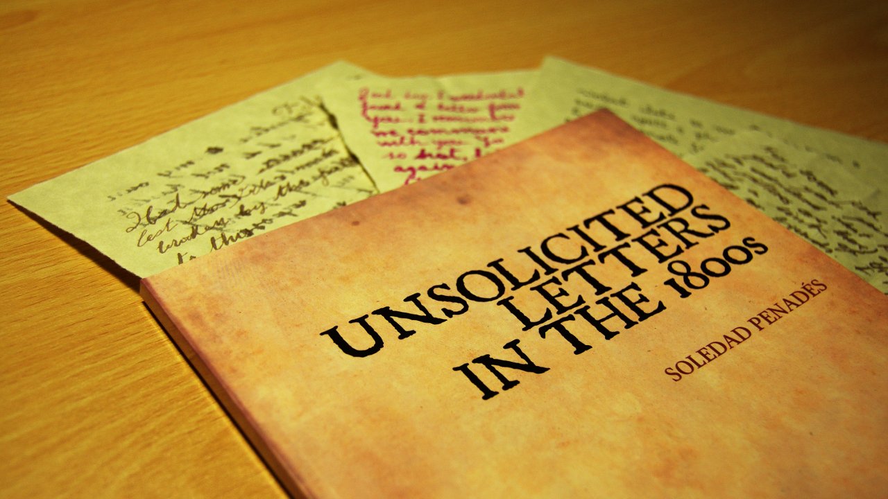
So what's that, you'll ask? Well, it's my book! My spam-inspired book! Yay!
TL;DR
I'll summarise it for you:
- I love/hate spam.
- What if spam was physical? Would people still click on it?
- Hand drawn. Ink + dip pen + "old" paper
- Assembled with Python, typeset with XeTeX :-P
- True Type fonts don't work with Blurb. Use Open Type/Type 1 fonts.
- The book is awesome. Buy it!
Keep reading for more details :-)
Why?
As years pass by, I have developed a sort of strange love-hate relationship with spam. On one hand, it is extremely annoying. On the other hand, it provides for fascinating imagery and surreal verbal constructs. And I'm not even talking about the bizarre stories you can find in them: from rich Dutch widows living in Madrid and willing to donate their fortune to you via a wire transfer, to Ghana ambassadors who have a surplus from certain government works and of course want to give it to you. It's a never-ending stream of craziness. And there's also their aesthetics, and the glitches in the way to your mailbox. It's all beautiful, in its own way, but not something that I would click or reply to.
And I wondered: why do people fall for these scams? Is it because they believe everything in a screen is true? Would they do the same if they got hand-written physical letters? If so, then how would spam look if it was handwritten? I also began collecting spam. I regularly visited my Junk folder and selected the best e-mails from there.
The drawing process
All the letters are traditionally hand drawn, using several dip pens and ink colours and papers. I first attempted to stain papers using coffee and tea, but the result wasn't specially good. Diluted inks didn't work either. I then found "Calligraphy paper" sheets which came in a pad with several sheet colours (white, cream, brownish), and despite it being sold as "calligraphy paper", it bled and smeared like crazy. I had to be ULTRA careful with these and avoid loading the pen with too much ink. Despite this, some "accidents" happened, but I didn't fix them, considering them equivalent to electronic glitches.
I also researched different calligraphy "hands". I used them as the basis for the styles, but I obviously added some variation and "individualism". That was quite funny, and quite an exercise, since I don't write as much as I used to do when I was a student, and my handwriting nowadays is a bit... erratic :-)
Technical details
I started assembling the book using Scribus --an open source alternative to InDesign, the latter being pretty much the de-facto publishing standard. Scribus is quite easy to use and very able to generate PDF documents that comply with all the publishing requirements. But it had two big cons:
- it's GUI driven, which means I had to create image boxes and load every image manually, etc, and
- the book is basically a series of high resolution images, and I managed to systematically crash the program when adding a certain amount of them
So I had to think of something else.
My first thought was LaTeX, but I wasn't very convinced about it, mostly because the default fonts it uses immediately inspire me a master thesis dejà-vu; changing them seemed too hard last time I tried to do so, and I didn't know how to alter the layout.
But turns out that someone had already attempted to make a photography book using LaTeX, and it had been a success. Even more, he had published a nice tutorial explaining how he did it--which was all I needed to get started. So many, many thanks to Eric Jeschke :-)
His template taught me so much about LaTeX. Well, actually about XeTeX, which is another typesetting engine that solved my fonts issue: XeTex can use TTF or OpenType fonts without having to prepare them first with a series of arcane commands (unlike with normal LaTeX).
The only thing that was left was finding out how to alter the page layout in the middle of the book. Why? Because I wanted to have part of it using a "normal" layout, with margins and all, and part of it with full bleed images, and no margin. The answer to this is the geometry package, but to use the \newgeometry command in Ubuntu I had to manually update that package.
With those questions answered, I wrote a simple python script that
- took a series of TIFF images,
- converted them to JPEG with embedded color profiles and etc (using the cvt script by Eric Jeschke)
- read a template .tex file with the foreword and some placeholders for the book content
- generated a series of \includegraphics and put them in the template
- and called xelatex and xdvipdfmx to generate a nice, publisher-compliant PDF for me
This really went well with my workflow, and allowed me to do changes and rebuild the PDF with just a couple of keystrokes, whereas with a GUI-driven program I would have had to click too much for my tastes :-)
I just had some disagreements with LaTeX when trying to align things the way I wanted. Which probably wasn't the proper typographical way of doing so, or maybe I'm just too used to the CSS style of designing layouts. But we finally agreed on something that we both liked, and I got the PDF, ready for uploading it to Blurb and submitting it to the "preflight check", as they call the verification process (in fact, I think that's a publishing term).
I uploaded the book, and to my surprise, it passed all the checks! But when I looked at the preview, some things were missing--specifically, the texts that used a True Type font face. That was certainly strange--wasn't XeTex supposed to work fine with True Type?
I installed Acrobat Reader in my computer, since the Scribus guide suggested using it because it's more accurate than evince for printing purposes: If it looks OK in Acrobat Reader, it should print fine
. But it did look OK in Reader too, and wrong in Blurb.
I wondered whether the PDF was using the system's fonts, even if the proper subset had been embedded in the file, so I copied the file to another computer (without those TTF files installed), and opened it there. It looked perfect too. What else could I do?
Answer: pay close attention to the document properties dialog. All the fonts that worked were "Type 1". The missing texts were using "True Type". That was it
, I thought. I just need to replace those True Type fonts with their Open Type equivalent
. Fortunately, I could find alternatives for both of them (Linux Libertine and JSL Ancient), and I rebuilt the PDF once I removed the True Type versions and installed the Open Type ones. It again passed the preflight check, and this time... all the texts were there! Yes!
On the physical product
I ordered a copy to make sure everything was where it had to be, and somehow expected it to take an awful amount of time since it would have to be printed in the USA and travel all the way from there... but no! It seems they have printers worldwide, and the book has been printed in the Netherlands. From there to London it just took a couple of days, or in other words, I got the book in less than a week since I ordered it. Very impressive.
The packaging was compact and slightly reminds me to the sort of packaging that Amazon uses: a sturdy cardboard envelope, only in white instead of brown. Inside it was the book, wrapped in a transparent cellophane sheet. Very neat :-)
I'm quite impressed with the book quality as well. The colours are spot on, paper quality is great, the binding is perfect, and the pages are properly cut. All in all, good finish, very professional and way better than some books from "established publishers" that I've seen.