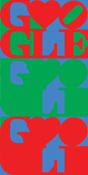
Google's Valentine's Day logo: a color blindness test or what?
As I'm in a bit of an owl mode lately, I was in front of the computer yesterday well past midnight. I visited Google to search for something a little bit after midnight and got hit in the face with their commemorative Valentine's Day logo. I've always found the contrast between strong red and green together absolutely unbearable, almost violent, so when I saw that, I wondered if it had been a joke, or a JPG glitch. But then I closed the search results page and forgot about the whole thing completely.
This morning everyone was talking about it again, and the hypothesis that it got something to do with color blindness really got me thinking. So I picked the logo, pasted and duplicated it in Gimp and attempted a couple of rude tests, first replacing all reds with green and then replacing all greens with red:

After all, that's how color blind people see, isn't it?
... no, I wasn't really convinced by this. Besides, I wasn't getting anywhere! There was no hidden message here or nothing I could really distinguish. So I remembered that there were color blindness simulators out there. Would they help me?
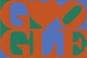
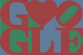
I found Coblis, an online simulator. You upload an image and then it can convert it to several other versions, according to the type of color blindness you select. And this is what I found:
Red-blind / protanopia

...those with this condition are unable to distinguish between colors in the green–yellow–red section of the spectrum
#
Green-blind / deuteranopia

... reduction in sensitivity to the green area of the spectrum. Unlike protanomaly the intensity of colors is unchanged...
#
Blue-blind / tritanopia

... those affected are unable to distinguish colors along the blue–yellow dimension.
#
Red weak / protanomaly

... protanomalous individuals are less sensitive to red light than normal
#
Green weak / deuteranomaly

... reduction in sensitivity to the green area of the spectrum. Unlike protanomaly the intensity of colors is unchanged.
#
Blue weak / tritanomaly

... Having a mutated form of the short-wavelength (blue) pigment. The short-wavelength pigment is shifted towards the green area of the spectrum
#
Monochromacy / achromatopsia

... strictly defined as the inability to see color
#
Blue cone monochromacy

A variation on monochromacy #
So what's my point?
My point is that if this simulator works properly, it means the logo can be read even if you have any sort of color blindness. Or in other words: very clever, Google, very clever.
But since this is based on LOVE by Robert Indiana, which follows the same super bold color palette, I can't but keep wondering whether it has all been intentional or just a nice Pop Art result? Maybe Robert suffers color blindness himself? His wikipedia page doesn't say anything on that regard.
Any other bet? Any opinions on the logo by color blind people in the room? :-)
Now if you excuse me, I'm going to go and stare at something plain and grey for a while, so that my poor eye cones can recover from the strain of looking at that violent, fiery disjunction I've been exposed to during the entire day each time I googled something!