Firefox, display: box, display: flex
Redesigning my 5013.es website to make it responsive and generally nice with mobile browsers and other small-screen devices, I stumbled upon some funny behaviour by Firefox, both in mobile and desktop.
Basically I wanted to have this sort of mark up:
<div id="wrapper">
  <div id="nav"></div>
  <div id="logo"></div>
  <div id="content"></div>
</div>
but if we're in a mobile context, or simply anywhere where there's hardly much space wide-wise speaking, I want the site navigation to go to the bottom, right under content.
This can be done with a combination of display: box and box-ordinal-group. So using media queries I could write something like this (NOTE: non-prefixed properties omitted for brevity):
@media screen and (max-width: 480px) {
    #wrapper {
        display: box;
        box-orient: vertical;
    }

    #logo {
        box-ordinal-group: 1;
    }

    #nav {
        box-ordinal-group: 3;
    }

    #content {
        box-ordinal-group: 2;
    }
}
and it works great...! But only until you start using percentages for dimensioning stuff inside the #content. Then Firefox starts producing some very strange results: even if it still reorders things as requested, it looks as if it's using a wrong height for the reordered blocks.
In my case, I was using some img elements styled like this:
#content img {
  width: 100%;
  height: auto;
}
and it looked fine in Chrome mobile:

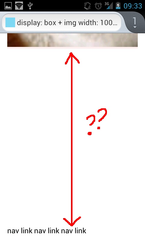
but it just created an absurdly tall white space block after #content when viewed in Firefox:
Realising I might be doing something really wrong by using display: box, which is meant not to be used anymore, since there's a new and very much improved standard module candidate, I looked into implementing the new one, which basically follows the same idea but uses different property names, probably to prevent breaking websites which used the old property names.
So I tried the equivalent layout with display: flex:
@media screen and (max-width: 480px) {

    #wrapper {
        display: flex;
        flex-direction: column;
    }

    #logo {
        order: 1;
    }

    nav {
        order: 3;
    }

    #content {
        order: 2;
    }
}
... and it only worked on Chrome Desktop. What an improvement! With some work I enabled support for display: flex in Firefox (the layout.css.flexbox.enabled preference has to be set to true in about: config), and saw that it worked there too, without unexpected white spaces.
So to recap, support for display: flex works well when present, but it won't be present in Firefox until version 20 is hopefully released to the general public in April (as this page says). No idea about support in Chrome mobile, maybe it's already there or about to be.
Back to my web, I wanted to have the new design this week, not in April, so I took a pragmatic decision: use display: box AND avoid percentages.
Since I know the max-width will be 480px, I'm using values less than that for sizing the elements. Not very elegant, but works on the mobile browsers of today (event the somehow ancient default Android browser).
Hopefully all this will have been fixed by April and I'll be able to get rid of the 'pragmatic hack'!
Here are the test files I've used, for reference and future comparison: